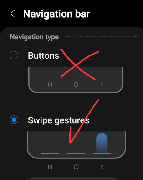
I’ve resisted this for a bit, but finally gave in and tried it out a week back. I opted for the three bottom swipes, so everything is still actually in the same position (to make the transition a bit easier) but I may still progress to the side swipe.
Yes, the muscle memory does actually kink in quite quickly, and I’m sticking with it. It gains a bit of extra screen space for you, but the theory too is that it is quicker to just swipe, than to aim for the actual buttons as a press. Also having recently switched back from using an iPhone, it actually feels a bit similar as iOS uses the swipe up for return to home screen, and swipe up and sideways to see recent apps.
See https://www.howtogeek.com/869806/its-time-to-stop-using-three-button-navigation-on-android/
#technology #Android #gestures #navigation

